Challenge
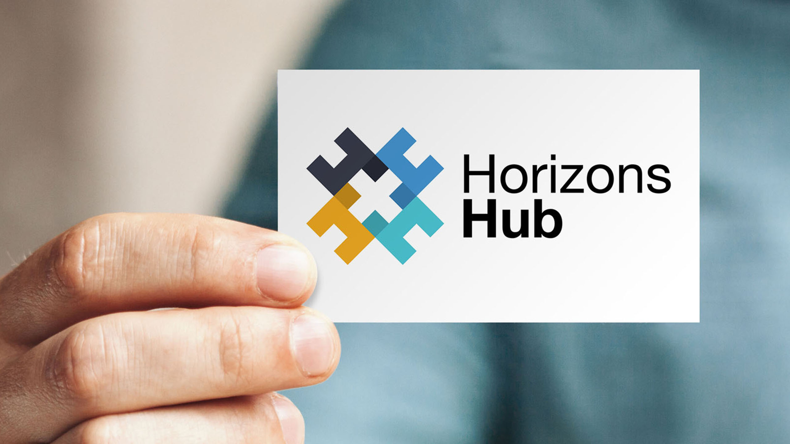
As part of a rebranding exercise PRG was approached to design and develop a new logo for the company’s new name Horizons Hub.

Solution
First impressions are often made based upon a company logo or the look of their website, which is why designing a new logo that fits the ethos of a business is a vital step in the rebranding process.
To start the process, PRG arranged a meeting with the Horizons Hub team to find out more about the business, what they liked/disliked about their current logo and define any specific requirements they had in terms of their new look and colour scheme.
With this brief our designer then created a selection of logo concepts and presented them to the client explaining the rationale behind each of them. Once the Horizons Hub team had chosen their preferred logo, our designer developed the concept to create the final artwork for the new logo design. We then supplied the artwork in various formats to use both online and in print, along with a specification guide explaining how the logo should be applied across various media.

Result
The new logo design the client chose was based on the letter ‘H’. A geometric pattern was created, formed by four uppercase ‘H’s that overlap each other to create an interlocking group or ‘Hub’. The client can now use this device and its shapes along with the chosen colour scheme for supporting course literature and online material to give the company a recognisable and distinctive brand.

